Porky
The Dwarf Hermie King
- User ID
- 17
All the pics look like this on my phone now.Test from the phone with a 1024px limit
View attachment 13156
Edit: It has cropped the image from 16:9 to 1:1. That won't work for a lot of uploads. Reverting.

All the pics look like this on my phone now.Test from the phone with a 1024px limit
View attachment 13156
Edit: It has cropped the image from 16:9 to 1:1. That won't work for a lot of uploads. Reverting.

Pretty much. Most sites use it to confirm people are “of legal age”. Obviously an “I am over 18” button keeps those 16 year olds out.There was a home/landing page when the site first started, but ended up removing it, cant actually recall why.
I think it is needed for people landing on the page for the first time, give them a bit of an idea what the place is about?... Though I guess it is pretty obvious. lol.
For regular users it should not matter would it? just navigate straight to the forums link, not the home page?
I am probably an edge case, I'm on a 24 inch monitor set at 2560x1440 so what I see is not the average experience people have. I have also never looked at it on mobile so I don't know what it looks like.@Anoma care to chime in?

I have a sneaking suspicion that Jim Lahey was reincarnated as Zorro_7You are so beautiful to me anoma. I'll be a purple panzy for you. Yours sincerely coco loco.
P.S. I apologise to you like Oz sit com homeaway style oh baby.
Biggest dickhead on the forums 2021 or else fergie. I request. Antipanti.
Pedro's alright BennoIve an idea, we should put a warning something like
I wish every new member the best but please be careful of pedro.
I have a sneaking suspicion that Jim Lahey was reincarnated as Zorro_7
I think that's just you. Anyone else confirm?All the pics look like this on my phone now.View attachment 13157
Lol no 1080p for you!I am probably an edge case, I'm on a 24 inch monitor set at 2560x1440 so what I see is not the average experience people have. I have also never looked at it on mobile so I don't know what it looks like.
That being said though, I use dark mode and the frame of the comment section is a pretty good size. As some of you may know it's an unwritten rule in programming to not have lines of text that are too long because it makes it hard to read and I think the length of the lines at the moment are a good length.
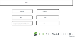
As far as the home page goes, I don't know if the site needs one but if it does then here's an idea for a design of what could be on it.
View attachment 13160
At least that way you could add sections to give new people an idea of what they're signing up for. Personally I'd stay away from making it too weed heavy (background pictures of leaves, etc), keep that stuff for the inside of the website in case people want to browse in public or at work or whatever. At least people know that if they click on someone's grow diary then there'll be pictures of weed but some other topics you know are safe to view when others are around.
I haven't had much time to think about but if you really think it's needed then we can all put our heads together, maybe a few designs and vote on which one looks the best and most functional.
Should be a warning about you climate believers and ya bullshit propaganda dressed up as scienceIve an idea, we should put a warning something like
I wish every new member the best but please be careful of pedro.
Its more polite than the Admin asking for Cash and giving a little kids badge in return? see the threadOr I could just fill the page with Google Ads for you all to click to pay for this site
I personally prefer a donation style system for site funding. It means the page isn’t filled with stupid amounts of ads. It’s worked for Wikipedia for how long now?Its more polite than the Admin asking for Cash and giving a little kids badge in return? see the thread
Its more polite than the Admin asking for Cash and giving a little kids badge in return? see the thread
Ohhh fuck please do.
